
Specialty concrete contractor, Midwest
Same crews, same pricing, better yes rate.
Nothing about how this company poured concrete changed. The crews were the same, the schedule was the same, and the numbers on the proposals did not move. What changed was every signal a customer picks up before they decide whether the price is reasonable. That is what professionalizing a brand actually buys you: the same number reads differently.
Client name withheld under NDA. Details anonymized.
The situation
The company competed against both large commercial outfits and one-truck operators, and looked like neither. The name was a personal name with no indication of what the business did. Proposals were plain documents with a number at the bottom. Job sites had no signage. Crews wore whatever they owned. On price alone the company was competitive, but it kept losing work to outfits that looked more established, and winning work from customers who assumed it should be cheaper than it was.
- Company name gave no indication of the trade or specialty.
- Proposals were plain text documents with a total and no scope framing.
- No job-site signage, so completed work generated no neighborhood awareness.
- No uniform standard, so crews read as day labor rather than employees.
- Frequent price pushback despite being mid-market, not premium.
- Larger commercial and municipal bids rarely made it past the first cut.
What we built
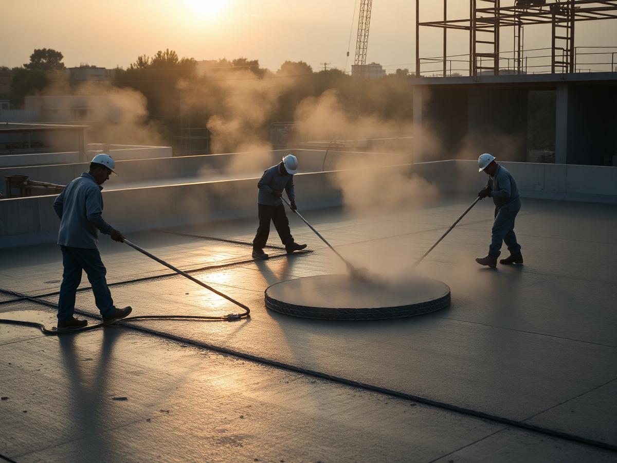
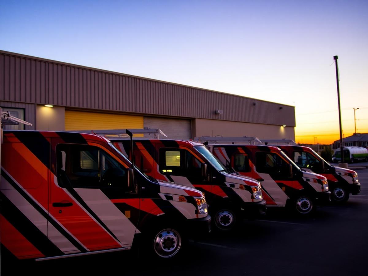
This was a discipline project more than a design project. We tightened the positioning so the company was clearly a specialty concrete contractor rather than a generalist, then made every physical and paper touchpoint reflect that. Logo and color got locked down and applied consistently. Trucks were wrapped on a single template. Crews got a uniform standard. Job sites got signage. And the proposal was rebuilt so the price sits inside a document that explains scope, materials, process, and warranty.
- Positioning and naming cleanup so the specialty is obvious at a glance.
- Locked logo, color, and typography system applied across every surface.
- Single-template truck wrap rolled out across the fleet.
- Uniform and PPE standard with branded shirts, hats, and high-visibility gear.
- Job-site yard signs and barricade signage on every active pour.
- Rebuilt proposal format with scope, materials, process, warranty, and price.
- Branded leave-behind for estimates so homeowners have something after the visit.
The result
Price objections dropped first, which is the clearest sign that perceived value moved. Estimators reported fewer conversations that started with a competitor's number and more that started with scheduling. Job-site signage created a second effect nobody had budgeted for: neighbors calling about work they had watched happen down the street. And on the commercial side, the rebuilt proposal document got the company past first-cut screening on bids it had previously never heard back from.
- Fewer price objections at the same price points, and less discounting to close.
- Proposal acceptance rate improved with no change to the underlying numbers.
- Neighborhood inbound generated directly by job-site signage.
- More consistent progression past first-cut screening on commercial bids.
- Crew retention and pride improved after the uniform and truck rollout.
- Referral conversations easier because the company was now easy to describe.

Same crews. Better yes rate.
45-minute discovery call. Bring a recent proposal and a photo of a job site. We will show you what customers see.
Book a discovery call